
Hands-on with Krea 1: Does It Really Get Rid of the “AI Look”?
I tested Krea 1 against GPT-4o, Seedream 3.0, and Imagen 4 to find out.

It’s a sign of our times that, when Krea AI released its first-ever in-house image model two weeks ago, this barely made a splash.
We’re constantly inundated with new language models, image models, video models, and other AI tools.
So when Krea 1 dropped, most of us collectively shrugged and moved right on.
I’m guilty of this, too. I’ve watched so many image models come and go over the years that a brand-new one rarely catches my eye (unless it’s something as paradigm-shifting as GPT-4o image generation).
But in its announcement, Krea made a unique promise that I’d like to put to the test:
“Krea 1 is our answer to the "AI look" problem. Most AI models suffer from soft textures, excessive contrast, and produce boring compositions or styles. Krea 1 ensures highly realistic, crisp textures, a wide variety of styles, and deep artistic knowledge—making AI images not look [like] AI anymore.”
An AI image model that sidesteps the “AI look”?
Color me intrigued!

So in today’s end-of-month visual exploration, I’ll see if Krea 1 lives up to that bold claim.
Ready?
The setup
Now, how exactly do we tell whether Krea 1 has an “AI look”?
Since there’s no official definition, I’ll do this by comparing Krea 1 to three other recent AI image models:
GPT-4o image generation (OpenAI)
Imagen 4 (Google)
Seedream 3.0 (ByteDance)
These models currently top the Artificial Analysis Image Model Leaderboard, so it makes sense to use them for benchmarking.
To make sure I’m comparing apples to apples, I’ll stick to the following for each model:
Horizontal aspect ratio
Text prompts only (no special features like auto-prompt, style transfer, etc.)
I’ll make four images per model for each prompt and select the best ones to compare.
Let’s roll!
The results
After some ChatGPT-assisted brainstorming, I settled on 10 prompts that cover a wide range of styles, shot types, etc.
Prompt #1
Extreme macro shot of a vintage wristwatch face. Engraved text says “Swiss Made.” Brushed steel texture.
Krea 1 output:

The three other models (click to view the full image in the right aspect ratio):


Who’s producing “boring compositions” now, huh, Krea 1?
Krea’s best output somehow still fails to properly reproduce the clock hands and is generally subpar compared to the other three.
To me, Seedream 3.0 has the most non-AI look of the bunch (focus blur, sunk engraving, camera angle, etc.). Krea’s image is rather bland, and its other three attempts also managed to butcher the short text:
Prompt #2
Woman sleeping on her side, hand tucked under cheek, golden hour light in a cluttered urban bedroom.
Krea 1 output:

The three other models (click to view the full image in the right aspect ratio):


In this test, Krea’s output does look rather natural and unpolished, but I feel the same can be said about Imagen 4 and Seedream 3.0. (As a bonus, Imagen 4 also respected the “cluttered bedroom” part of the prompt.)
GPT-4o definitely looks the most stylized and unnatural of the bunch with its saturated yellow hues. (It did nail the clutter, though.)
Prompt #3
Candid photo of a father and toddler reading on a couch, toddler leaning back mid-stretch.
Krea 1 output:

The three other models (click to view the full image in the right aspect ratio):


Krea 1 is not bad here, but I think Imagen 4 best nails the unposed, candid look. I also quite like Seedream 3.0 output, and even GPT-4o does okay, although it’s hard to shake a certain uncanny valley vibe from it.1
As for prompt adherence (“leaning back mid-stretch”), Krea 1 falls behind once again.
Prompt #4
Long‑exposure photo of cars moving through a rain-soaked city street at night, with bright taillight trails and reflections.
Krea 1 output:

The three other models (click to view the full image in the right aspect ratio):


This is the first prompt that truly does justice to Krea’s “not-looking-like-AI” claim.
The other images look too clean, stylized, or cinematic, while Krea’s could definitely pass for a true amateur photograph at first glance.
Prompt #5
Portrait of an elderly man with a gentle smile and weathered face wearing glasses. Subtle film grain aesthetic.
Krea 1 output:

The three other models (click to view the full image in the right aspect ratio):


Yup, this also checks out. Krea’s elderly man photo does have an authentic vibe to it, including the barely visible film grain.
GPT-4’s isn’t bad per se, but it does look a bit too crisp, especially considering it’s supposed to pass for a vintage black-and-white photo. Imagen 4 seems to be trying too hard by sprinkling unnatural “film grain” elements all over the place.
But I do like the Seedream 3.0 version, too, especially the off-center cropping and a caught-in-the-moment feel.
Prompt #6
Surrealist drawing of a dreamlike desert scene with otherworldly, alien trees rising up into the sky at sunrise. Soft pastel colors.
Krea 1 output:

The three other models (click to view the full image in the right aspect ratio):


GPT-4o wins this one in my book. It’s the only model that respected both the “surrealist” and “drawing” parts of the prompt. Krea’s looks more like a behind-the-scenes photo of a bootleg Star Trek set. Imagen and Seedream 3.0 went for a cartoony vibe that doesn’t feel particularly surrealist.
Prompt #7
Digital illustration of a steampunk insect world with mechanical dragonflies resting on metallic foliage.
Krea 1 output:

The three other models (click to view the full image in the right aspect ratio):


I’m not too impressed with Krea’s take here, either. None of it screams steampunk, mechanical, or metallic. Seedream 3.0 stuck a pair of fake dragonfly wings on a bee and called it a day.
GPT-4o is again the only model that reflects both the “illustration” aspect and the requested steampunk elements.
Prompt #8
Oil painting of knights on horseback crossing a river, with flowing capes, splashing water, and dramatic skies.
Krea 1 output:

The three other models (click to view the full image in the right aspect ratio):


Not too bad, although I’m not sure about the weird pointy porcupine quills the knights are holding. I feel all models have something to offer, and I especially like the sense of motion in the Seedream 3.0 image.
GPT-4o and Seedream 3.0 also simulate the brush strokes quite well, but GPT-4o has that “yellowish tint” thing going again.
Prompt #9
Hand‑painted ukiyo‑e woodblock print of a thunderstorm approaching a small fishing village, traditional Japanese color palette.
Krea 1 output:

The three other models (click to view the full image in the right aspect ratio):


Krea continues to consistently ignore basic prompt instructions (“thunderstorm,” in this case).
Which of the takes do you like the most?
Prompt #10
Minimalist line art: a single unbroken black line forming a cat curled on a cushion, white background.
Krea 1 output:

The three other models (click to view the full image in the right aspect ratio):


This minimalist take should’ve been a cakewalk.
Yet, for some odd reason, Krea 1 really struggled with it. The image above is actually Krea’s best attempt at a “cat.” Its other takes included elephant-tapir, otter-fox, and seal-weasel hybrids:
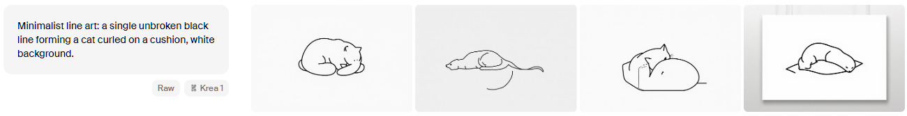
Seedream 3.0 decided to ignore the “single unbroken line” challenge altogether and went for its own thing. Both Imagen 4 and GPT-4o images could’ve conceivably been drawn without lifting the brush, if backtracking was allowed.
Observations
Based on this test, it’s hard to hand Krea 1 the Ultimate Non-AI Look™ crown.
While the model shines in a few niche cases, it’s far from being a consistent outperformer that Krea positions it to be.
Here are a few quick thoughts and tips based on my brief exploration.
The good
Krea is really fast, generating images in seconds and giving you a real-time preview. Check this out (actual speed):
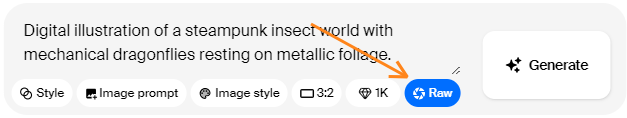
Krea 1 can be great for that raw “non-AI” vibe in certain cases, especially when going for natural-looking photos (see “long exposure cars” and “smiling old man” in our test). Hint: If you want to aim for that unpolished feel, toggle the “Raw” setting in the feature ribbon:

As a platform, Krea.ai has a lot to offer: Style transfer, style mixing, image prompts, access to third-party video and image models, real-time mode, and much more. It’s a great all-in-one package, even if the Krea 1 model itself might not be your cup of tea.
The bad
Krea 1 is not a great speller (I should know) and could barely handle the short “Swiss Made” engraving after four attempts. So it likely won’t become your go-to model for any typography-related tasks.
Similarly, Krea 1 is one of the less prompt-adherent models, often ignoring important actions and style cues in text prompts.
All in all, Krea 1 is a fun model for style exploration (especially when combined with the platform’s style transfer and style mixing features), but it wouldn’t be my primary choice for any work requiring precision.
🫵 Over to you…
What did you think of Krea 1’s images? Where was it strongest? Which model is your favorite across the board (if any)?
Leave a comment or drop me a line at whytryai@substack.com.
Thanks for reading!
If you enjoy my writing, here’s how you can help:
❤️Like this post if it resonates with you.
🔄Share it to help others discover this newsletter.
🗣️Comment below—I love hearing your opinions.
Why Try AI is a passion project, and I’m grateful to those who help keep it going. If you’d like to support my work and unlock cool perks, consider a paid subscription:
If you can put more precise words on what makes it feel off, let me know!
what's the em-dash moment for image generation? I can see a whytryai leaderboard that distills it down. When i go to AI to draw me a picture, unless I include in the prompt 'make it look like my granny took a crappy snapshot,' I want dramatic.
I think you know how much I presently loathe GPT-beige, the grossest and most abundant internet color of all of 2025.
I do think these edge cases are going to be where a lot of the action is - even if they don't really solve it, the other models are now addressing this idea too. Interesting to see ideas getting out into the ecosystem so quickly!