
New Interactive Explainers: ChatGPT vs. Claude vs. Gemini
How do the three recently launched interactive visual features compare?

EDIT (April 15, 2026): Article updated with five new Gemini tests.
In March, Anthropic and OpenAI both released interactive visual explainers for their chatbots. Google followed suit a month later.
These explainers supplement your text chat with diagrams, charts, and other visuals you can manipulate to help you better understand concepts.
This brought me right back to August 2025, when the same three companies near-simultaneously released their versions of “study” modes:

Just as I did then, I wanted to see how the ChatGPT, Claude, and Gemini versions compared.
So I went ahead and tested them, because who’s gonna stop me?!
How do the interactive explainers work?
Although the idea is similar, the three companies approach it differently.
ChatGPT
OpenAI chose to curate a shortlist of 70+ STEM concepts in advance, so when you ask about them, ChatGPT should automatically pull up the relevant visual explainer.

These explainers are pre-built and will always look and work the same way.
Claude
Claude, instead, designs a new interactive explainer from scratch every time:
Because of this, Claude’s explainers aren’t limited to math and science topics and can also be requested on demand with relevant commands:
Claude will decide when to build a visual for something, or you can ask it to do so directly (with a query like “draw this as a diagram” or “visualize how this might change over time”).
Gemini
Gemini works a lot like Claude, and it tends to provide both the in-depth text explainer and an optional “Show me the visualization” button by default:

Here’s Google’s example with Gemini visualizing how fractals work:
So how does this work in practice?
Let’s find out!
The five tests
Note: I wanted to test “compound interest” and “exponential decay” in addition to the Pythagorean theorem, but ChatGPT couldn’t actually trigger any interactive explainers for me.
As such, I’m comparing the three examples OpenAI showcased on the page.
Even though I have a paid Anthropic plan, I am testing with the free versions of each tool to reflect the average user’s experience and keep the comparison fair.
Since ChatGPT only has its preset library to pull from, this can’t be a true apples-to-apples comparison.
Instead, I’ll kick off with three explainers from ChatGPT’s list and supplement with two freeform ones that Claude and Gemini might be better able to build on the fly.
Test #1: Pythagorean theorem
Let’s take a trip down memory lane back to our school years and basic geometry.
Prompt: “Explain the Pythagorean theorem.”
ChatGPT
ChatGPT’s version is pretty barebones, but it does the trick:

I can adjust the lengths of the a and b sides (legs) to see how this affects the c side (hypotenuse). The formula below the sliders explains the relationship.
Claude
Claude didn’t trigger any visuals automatically and provided a text explainer first:

But when prodded to “Show me interactively,” Claude built what’s arguably a better version of ChatGPT’s pre-made diagram:

I like that Claude color-coded the sides and mapped the calculations directly onto the corresponding squares. Much easier to connect the dots!
But I do wish Claude had included the square root calculation for the c side to really bring this home.
Claude also lets me save the resulting diagrams as Claude Artifacts, so I’ll be sharing them here:
Gemini
Unlike ChatGPT, Gemini also built the visualization from scratch.
And unlike Claude, Gemini offered to visualize it without being explicitly asked to:
The result is very similar to the other two models, but Gemini made questionable decisions about text color and placement for the “leg” labels. It also doesn’t explain what’s happening quite as well as Claude does.
My take
While all three do largely the same thing, I find that Claude’s version is the easiest to parse at a glance, even though it doesn’t provide the final connection by visually mapping the square root calculation back to the length of the hypotenuse.
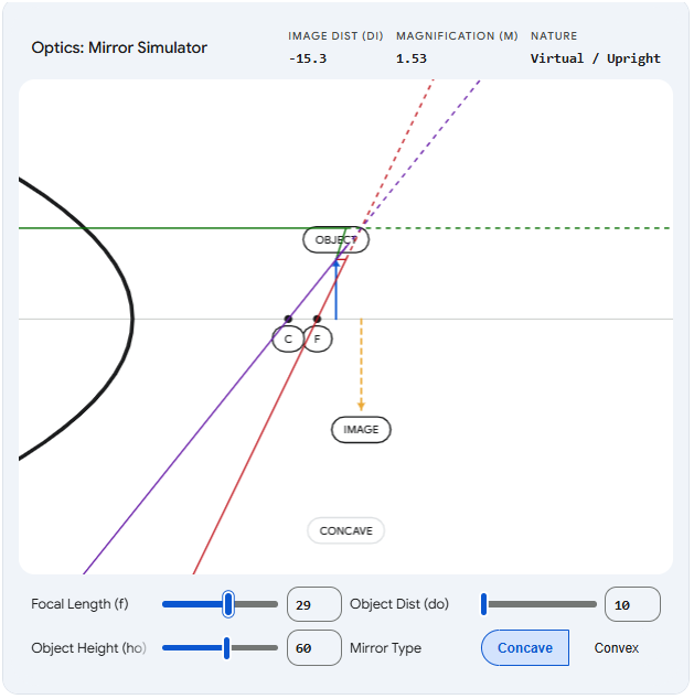
Test #2: Mirror equation
Yet another equation I’d long forgotten everything about. Fun!
Prompt: “Show me the mirror equation.”
ChatGPT
ChatGPT uses the same clean blue-line diagram style for this:

Claude
Claude made a visual by default this time, but a static rather than interactive one:

Again, this was an easy “Show me interactively” fix:
, magnification of 0.18 (upright), and image size of 0.18x (diminished)")
While Claude’s visual is again prettier to look at and shows helpful color-coded effects, the lines of the diagram don’t always connect to the mirror in a way that’s easy to grasp:

Gemini
This time, I had to nudge Gemini to create a visualization, but it ended up with a similar concept as the other two models:
But it suffered from even more visual issues than Claude did. The mirror itself would slide around instead of staying fixed, which certainly doesn’t help follow the logic.
My take
I’m still impressed by Claude’s ability to create on-the-fly visuals that are very close to what ChatGPT has pre-coded for it. Bonus points for letting users pick and visualize concave vs. convex mirrors.
The downside is that diagram elements sometimes connect in ways that aren’t fully clear, so the value you get from them depends on your existing understanding of the concepts.
The problem is even more pronounced with Gemini. Even though it provides the right sliders and selections, the movement of objects is too inconsistent for the visualization to be truly helpful.
Test #3: Ideal gas law
If you’d asked me to explain this one before working on the article, I’d have stared at you with a blank expression before slowly backing away. But here we are.
Prompt: “Demonstrate the ideal gas law for me.”
ChatGPT

I like that the animation makes it instantly clear how gas molecules speed up at higher temperatures and why pressure might increase as the volume decreases. It’s perhaps the most visually intuitive of ChatGPT’s examples.
Claude
Claude made a graph with slider options instead of a visualized container:
, volume (17.23 L), and temperature (210 K), three adjustable sliders, tabbed graph views for isothermal, isobaric, and isochoric relationships, and variable definitions below")
But I wanted to see if Claude could mimic ChatGPT’s version, and it 100% could:
, volume (27 L), temperature (370 K), and moles (5 mol), a container with bouncing blue molecules of varying sizes, the live PV=nRT equation calculated below, and sliders for temperature, moles, and volume")
You get the same intuitive feel for molecule speed and pressure impacts, with better layman-friendly labels, too.
Gemini
Gemini triggered the visualization option by default and ended up with something very similar to Claude again:
I like the subtle touch where the moles change color at different temperatures, and I find the shrinking container visual better than Claude’s.
My take
The pattern is clear: Claude can usually match ChatGPT’s visuals, but it often needs a bit of prompting to get there, which requires the person to know what they’re after. ChatGPT’s visuals should pop up by default to supplement its text-based answers.
I prefer Gemini’s interactive visual to Claude’s this time around. It also required less additional prompting to build the visualization.
Test #4: Combustion engines
We’re now moving out of ChatGPT’s pre-programmed “comfort zone.”
Prompt: “Show me how an internal combustion engine works.”
ChatGPT
Oh man, this was a quadruple fail right out of the gate.
ChatGPT instantly defaulted to text, ignoring the “show” qualifier completely:

When I nudged it using the “show me interactively” (which worked for Claude), ChatGPT created an image:

I then tried to be even more explicit by saying, “I want something I can actually manipulate and interact with.”

ChatGPT gave me a text buffet of options. Finally, I had to ask it for HTML outright:

The result was super basic and didn’t do much to explain the individual steps:

No helpful labels of any kind. The piston escapes outside the cylinder. Manipulating speed doesn’t affect the way the engine works, so the decision to include it is questionable.
Finally, ChatGPT couldn’t create anything shareable, so I had to paste its HTML into a third-party site to be able to share it here:
Claude
For once, Claude nailed the task on the very first try:

It spit out a clean, visually pleasing four-step diagram that I could click through to understand the concept clearly.
Take a look for yourself:
Gemini
Gemini followed in Claude’s footsteps yet again, but also added a neat animation feature to show the process in action.
Is it just me, or, when animated, the steps don’t match up with the motion of the piston? When clicking on the static steps, everything’s correct, but as soon as the engine starts moving, the piston ends up in the opposite spot at every step.
My take
Man, this wasn’t even close.
Not only did Claude intuitively know what I needed, but the result was significantly better with far less effort.
Gemini is a close second and could have even outshone Claude with its animation feature, but unfortunately, the animation did more harm than good in this case.
Test #5: Tectonic plates
Let’s give ChatGPT a chance to redeem itself!
Prompt: Show me the major tectonic plates and their movements.
ChatGPT
Oh no, here we go again:

ChatGPT has apparently never heard of “show, don’t tell.”
Let’s be more explicit again:

Behold, the “Tectonic Plate Map”:
There you have it, kids: Tectonic plates are unidentified colorful rectangles that are permanently stuck to each other!
Any questions, class?
Claude
Again, Claude did better right out the gate:

But I wanted this to be more interactive, so I nudged:

It worked!
The visual isn’t winning any awards for aesthetics or geography, but it does actively aid my conceptual understanding and provides useful info about each plate in a clean modal box.
The list of major plates is complete and accurate, according to Wikipedia.
Gemini
Gemini again ends up with something similar to Claude:
And again, there are caveats. Despite listing the major tectonic plates in its text response, Google decided to visualize the minor Nazca plate and failed to show the Antarctic plate, which is a major one. Also, its directional errors different a lot from Claudes, so I had to double check. Claude got more of them correct based on my research.
Finally, I’m not sure what the benefits of extending the arrrows or switching to a “Physical Map” are, since the visualization is abstract anyways.
My take
Claude is consistently more visually engaging and genuinely helpful at showcasing concepts on the fly. Gemini is generally similar but falls short of both Claude’s look and accuracy.
ChatGPT struggles to visualize anything outside of its library of approved templates. Even with repeated nudging, the outcome isn’t nearly as polished as Claude’s versions.
General observations
Here are my concluding thoughts.
Note that they’re based exclusively on my limited tests with free versions of each tool.
I’d expect paid model options like GPT 5.4 Thinking and Opus 4.6 to handle these tasks better.
Google does let you its Gemini 3.1 Pro version for free (with a strict quota), so that’s what I’ve been using.1
However, since interactive explainers are marketed as being available to everyone, I think it’s only fair to mimic the experience of the average user.
ChatGPT (“The Curator”)

While it didn’t work for me, the idea behind human-approved visualizations popping up automatically for given topics is solid.
The good: For the pre-approved topics, ChatGPT should load the visuals almost instantly. They’ll be precise, predictable, and guaranteed to show accurate equations. Also, since they trigger automatically, the user doesn’t even have to know this option exists or learn how to invoke it.
The not-so-good: The visuals are rather basic and often feel dry and technical. When you move beyond the shortlist, ChatGPT truly struggles to create helpful, interactive elements on its own.
Who this is for: School and high school students who have specific STEM concepts fresh in their minds and need to anchor them with visuals.
Claude (“The Designer”)

Despite not having a curated library of concepts, Claude is strictly better at coding polished interactive elements from scratch, even on a free account.
The good: Claude’s explainers almost always look pretty, have more helpful labels, and—at least in my tests—are easier to grasp at a glance, especially fo concepts that don’t come from ChatGPT’s STEM list.
The not-so-good: Since Claude’s explainers are always designed on the fly, they’re less predictable. You’re essentially rolling the dice whenever you ask for a new visual. Without a robust review, Claude’s outputs are subject to the usual AI hallucinations, which might defeat the purpose of helping a layman understand brand-new concepts. Finally, Claude often needs prodding to create an interactive element, so people who aren’t aware of this feature might not even get to experience it at all.
Who this is for: People who want to grasp almost any complex concept in a flexible, visual, and interactive way.
Gemini (“The Animator”)

Gemini usually provides a hybrid answer that explains the concept in writing while also providing an optional “Show me the visualization” step.
The good: Gemini reliably triggers visualizations for most learning topics without being prompted. This is more likely to expose the “interactive explainer” feature to people who aren’t already aware of it. Gemini is also eager to try animating the visuals.
The not-so-good: While Gemin’s conceptual explainers end up similar to Claude’s, they’re typically less polished and more buggy, at least in my testing. In some cases, this undermines the entire purpose of an explainer.
Who this is for: People who don’t know the interactive option exists and want to get a feel for its potential for the first time.
🫵 Over to you…
Of course, these are just my subjective thoughts based on a limited range of tests.
You may get very different results.
So take these for a spin yourself and let me know what you think.
Pick a concept you always struggled with and see if interactive explainers make it stick!
Thanks for reading!
If you enjoyed this, here’s how you can help:
❤️Like this post if it resonates with you.
🔄Share it to help others discover this newsletter.
🗣️Comment below—I love hearing your opinions.
Why Try AI is a passion project, and I’m grateful to those who help keep it going. If you’d like to support me and unlock cool perks, consider a paid subscription:
In fact, using Fast and Thinking options didn’t even trigger visualizations for me in Gemini.
High School teacher Andrew is paying attention. My classroom toolbox so far is NotebookLM + Gems (and potentially other Gemini suite stuff because - Google Classroom.) My kids - definitely respond to visuals and I have two units to cover in under two months before the big test so I need all the help I can get. It does need to be somewhat prescriptive and repeatable though. Got any advice?
On this specifically, compound interest and exponential decay both worked for me in ChatGPT (paid, auto/5.3). Claude made a whole pretty .jsx app ‘Interactive Visualizer’ to show me exponential decay. Tryhard. (Paid, sonnet 4.6/extended)
Then I tried some stuff I’m going to need. Public Key Cryptography - ChatGPT spit out walls of text followed by walls of visual explainers when pushed to ‘show’. Claude did better making an web site https://claude.ai/public/artifacts/065cd6f9-2167-47c9-aafe-790a1b58c751
I can see where these are great for an individual, but I’m not sure how I can use them in my class
(btw when are you going to install OpenClaw and give an explainer on how to do it without buying a Mac mini or exposing all my secrets to the internets? Don’t make me beat you to it … that’d be a fun project to install on the school laptops …)